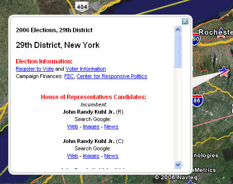
 Not sure if anyone else noticed this or not but did you catch the graphics that are being used by ABC news and Good Morning America etc... to show the results of the election? The graphics that show the electoral boundaries extruded as 3D objects on top of a nice white map is totally boring to say the least. I'm amazed that with all the data floating around that the cartographers for the news giant used Google earth to display these images - not that there's anything wrong with that, however, my thinking is that the images displlayed could have been made to be a little more exciting. Simply put, the maps are boring and are not in any way indicative of what you can show off using Google Earth. Did you see any maps that got your attention? the simple, white State map with 3D objects is about as plain as can be and looks like it was thrown together in about 5 minutes. If you want some decent results you might consider looking at http://www.electoral-vote.com/. Note, election results are easily viewed inn google earth via the 2006 election guide layer - see Google Earth - Layers - 2006 Election Guide.

November 08, 2006
ABC 2006 Google Earth US election maps.. yawn!
Not sure if anyone else noticed this or not but did you catch the graphics that are being used by ABC news and Good Morning America etc... to show the results of the election? The graphics that show the electoral boundaries extruded as 3D objects on top of a nice white map is totally boring to say the least. I'm amazed that with all the data floating around that the cartographers for the news giant used Google earth to display these images - not that there's anything wrong with that, however, my thinking is that the images displlayed could have been made to be a little more exciting. Simply put, the maps are boring and are not in any way indicative of what you can show off using Google Earth. Did you see any maps that got your attention? the simple, white State map with 3D objects is about as plain as can be and looks like it was thrown together in about 5 minutes. If you want some decent results you might consider looking at http://www.electoral-vote.com/. Note, election results are easily viewed inn google earth via the 2006 election guide layer - see Google Earth - Layers - 2006 Election Guide.
Subscribe to:
Post Comments (Atom)
1 comment:
I didn't see much of interest on TV, but the New York Times has some cool maps online (as usual). One that is new today has two maps of a state side by side, the left with winning percentage in Senate race by county, the right with another variable (race, income, 2004 presidential vote--you can choose), and as you pan around, an info box follows your cursor in both maps to give the details of the county you're in. Check it out:
http://www.nytimes.com/ref/us/politics/08RESULTS_SENANALYSIS.html
Post a Comment